Wednesday, 22 January 2014
Monday, 20 January 2014
Q2 - How effective is the combination of your main product (video) and ancillary text (digipak and advertisement) ?

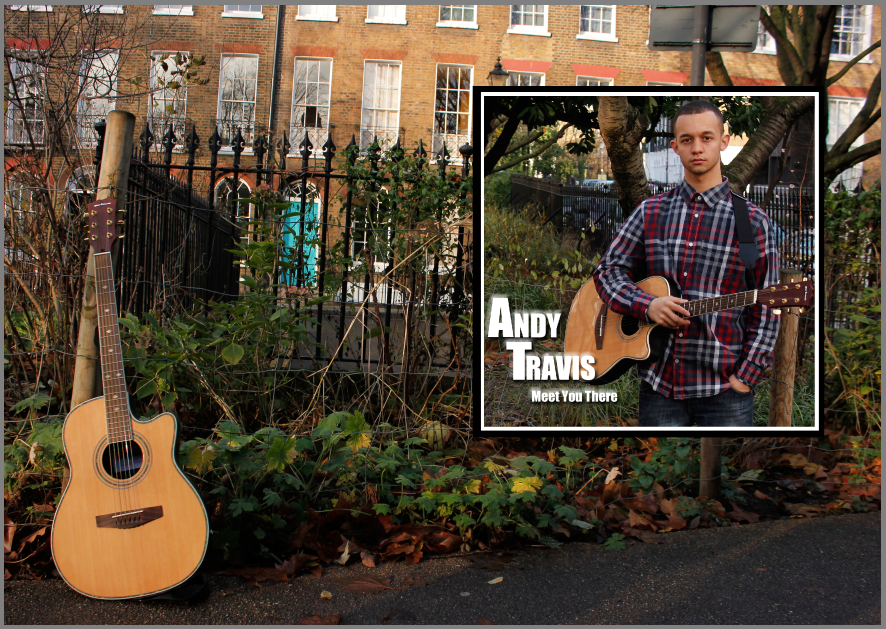
This GIF illustrates the synergy of the guitar used throughout and the artist wearing the same clothing throughout which creates a link. also shows you how I've used the same colour/font text in the ancillary and shows the 'gears4music' portrayed in cover and music video. all of which i expand on in the clips. I also speak about different aspects of how there is a combination between ancillary and music video in the video clips however the GIF should help give a visual link the my video clips.
Q3 - How did you use media technoligies in the construction and research, planning and evaluation stages?
We also used sites such as Youtube to post bloopers, behind the scenes and test shots, to keep people updated on whats going on.
Question 1
In what ways does your media products use, develop or challenge forms and conventions of real media products?
Question 2
How effective is the combination of your main product (video) and ancillary text (digipak and advertisement)?
Question 3
How did you use media technologies in the construction and research, planning and evaluation stages?
Inner Panel CD
To get the perfect CD shape I used the ellipse tool to form the larger circle I then used the eraser to cut out the middle part. I tried versions of the CD using pictures of the artist and the environment but it all looked too cluttered so I settled for a solid colour.
Copyright info
The copyright information on the back of albums is something I don't ever take notice of however to provide realism it needed to be there. To help me know what to write I used Mumford & Sons' Album Babel this way I knew that what I wrote would be fitting with the Genre and look professional.
Air Brushing The Digipak
Like most humans, celebrities have imperfect skin. To make them more appealing on album covers and in magazines editors use Photoshop to make any small imperfections disappear. To keep true to the industry I decided to airbrush a close up picture of my artist to get rid of any spots. To do this I used the Spot Healing tool in photoshop which covers the spots with colour and texture from the surrounding area.
Magazine ad mock up
This is a practice/plan of my magazine ad. I did this so I can get a clear idea of the route i was taking, so when I go on photoshop it will be easier as I already have a concept of what i am doing. Although I changed many things in the final product such as the image a text color, it helped me with the layout and where the text will be
Friday, 17 January 2014
Changing the colour of text to fit conventions
The collage below illustrates the changes I made to my magazine cover in order for it to match with the album cover. I originally was going to have the writing green throughout however it didn't go well on my album cover therefore changed it to white, which meant I had to change it on my magazine ad aswell. The bottom right picture shows me making amendments to the colour of the writing to white so both match. The image on the bottom left of the collage shows the final product.

Making amendments to my magazine cover
In this picture it is evident that I am changing the font of the text in my magazine cover. I did this after I decided to change the font on the album cove. As the fonts must correlate in order to follow the conventions I changed the font of the magazine cover to 'copper black' as I am seen doing below
Wednesday, 8 January 2014
Monday, 6 January 2014
Changed I have made towards my ancillary.
This is a GIF I have created to show all of the changes that I have done throughout the creation of my ancillary. There are pictures including myself experimenting with different type of font and asking feedback from others to ask for their opinion on it. I have also adjusted the size of stars the location the stars are put and align all the text in one side to make it look organised rather than scrambled everywhere.
I have also added white boxes with low opacity or black boxes with opacity to enable the audience to be able to read the text properly as some of the background images did blend in with the text therefore I also changed the colour many times to see how it would make the font stand out.
Friday, 3 January 2014
Subscribe to:
Comments (Atom)


